


![]()
Designing a unique logo is probably one of the toughest parts of creating a brand’s identity. Though it’s just a representative entity, the logo speaks volumes about the credibility of the brand, often to the extent that it’s more identifiable than the name of the company.
Owing to the fact that a logo is the essence of branding, it should be designed to correctly convey your business goals and leave a long lasting impression on the customers. Investing a good amount of deliberation and creativity along with systematic planning is essential to create the perfect logo for your business.
Below are some essential and useful logo design tips that should be followed in order to create a unique and unforgettable impression:
Envision The Brand
No matter if the logo consists of plain text, symbol or a combination of both, it should be completely synchronized to your type of business. While it’s not essential to include the services or keep the logo relevant to the company, it should be able to set you apart from the rest.
For instance, take a look at Apple’s logo. It doesn’t clearly mention the products offered by the company, but it’s easily distinguishable.
![]()
It’s important to determine the audience you want to target and what kind of logo would catch their attention. Understand your business type – is it more professional, like IT, finance, real estate, etc? Or does it have a more casual approach, like fashion, interior design, or media? Each element of the logo, right from font style to the colors, should be decided with this in mind.
The Logo Should Be Allegorical
The logo shouldn’t only be a piece of art, pattern of lines or a collection of words. Rather, it should have a deeper meaning and represent the ideology of your brand. It should depict the underlying purpose and intensive thinking you have given into the designing process. Take the Toyota logo given below as an example.
![]()
It’s not merely a stylish ‘T’ representing the company’s initials. As described by Toyota, the two overlapping ovals within the logo represent the mutual trust and positive relationship between the company as well as its customers.
The outer oval depicts the global reach of Toyota.
The empty space within the logo stands for the company’s infinite values – excellent quality, the joy of driving, invention, integrity in safety as well as environment and social responsibility.
Deciding Between Symbol And Text
You need to establish a strong brand identity to be able to solely represent your business with a symbolic logo. In some cases you have the option to go with what’s known as a “logotype”, or plain text displaying your company’s name – which can be used for businesses that have a unique name.
If possible, though, you should consider having a logo mark along with the company’s name to make it easily identifiable. Here are some examples:
![]()
Keep It Simple And Versatile
Simplicity is the basis of an effective logo. A complicated logo wouldn’t only be difficult to identify but may be difficult for the users to remember for long.
A simple logo can be used with more flexibility in any size and with different backgrounds. There shouldn’t be too many elements to distract the viewers and hide the main idea of the logo.
Make sure it’s scalable enough to be perfectly printed on different sized materials like envelopes, papers, files, coffee mugs, posters etc.
Here are some examples of simple and versatile logos:
![]()
Pay Emphasis On Aspect Ratio
Ensure that the logo looks perfect in all instances. There should be harmony between the height and width of the logo.
A logo that is too short or too broad may not be visually appealing, and you may also face problems while using it in different sizes for business cards, billboards, posters etc.
Ideally, a well-designed logo should be closer to the golden aspect ratio. It’s not a hard and fast rule, however, as both square and circular logos can be very appealing if designed well.
Choose The Right Colors
Color selection can be a major factor determining if your logo will stand out. Though vibrant and bold colors may be attention grabbing, they can also appear blunt in some cases.
You need to understand the psychology of colors. Each color has a different implication; white signifies simplicity and purity, whereas yellow depicts optimism and innovation.
The colors you choose should be relevant to your business as well as the age, gender, and cultural orientations of the target audience.
You can use complementary colors in your logo but it’s a good idea not to use more than 2 or 3 shades or it can look needlessly busy.
Limit The Use Of Words
If you want to include a tagline or use your company’s name in the logo, make sure you don’t exceed more than 4 to 5 words.
The logo is intended to be easily memorable in the minds of the people, making it lengthy may not serve this purpose.
The text needs to be catchy and readable to allow ‘word of mouth’ marketing for your brand.
Avoid Too Many Special Effects
If you feel the need to go overboard with your company’s logo to make it attractive, there’s probably a deeper issue with the design.
The logo should look good and depict the required message even in monochromatic colors.
Any special font or style effects can be incorporated at a later stage, if required. Also, don’t use any complicated or unusual shapes in the logo as it may confuse the viewers.
Consider Custom Typography
If you plan to include your company’s name as the logo, the font you use should be creative and unique to your brand.
A custom font will be even more identifiable than using the popular ones.
You can use Adobe Illustrator to customize any font according to your preferences, provided that it remains readable, you just need to make sure the font style isn’t too bold nor too thin. Not only will a custom font be unique and everlasting, but also prevent plagiarism.
Here are some of the best examples of efficient use of custom typography in a logo design:
![]()
Don’t Use Clip Art
Unfortunately, many designers prefer to use the clip art and images available online to create the logo. This reduces the uniqueness of your brand and potentially runs the risk of looking almost identical to another logo.
You should always focus on using your own creativity and design innovative illustrations that make a long lasting impression on the customers.
A final point: clip art can also be easily copied as you don’t have the copyright, meaning anyone would be able to easily duplicate your design.
Avoid The Clichés
Make sure you don’t use images that are obvious and used quite often. These may include using a light bulb for ideas or a globe to refer international expansion etc. An idea that can commonly strike everyone wouldn’t help you design an exceptional logo for your business.
Besides being unique artwork, your logo should also be something relevant to your business. One example of a logo that depicts this kind of creativity at its best would be that of LionBird:
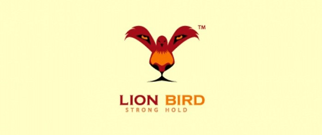
At first glance, the logo represents a colorful bird along with the brand name. But when you have a closer look you will see a lion’s face as well.
Use Negative Space Effectively
If used efficiently, the negative space surrounding a logo can turn out to be a real advertising element for your brand.
Using contrasting colors in a creative manner can make a dual image and representation of a single logo. It’s a great way to catch the customers’ attention and make them view it more closely.
Here are some of the logos depicting a competent use of negative space:
![]()
At first, the logo simply appears to be the name of the company, FedEx. However, the negative space between the letters ‘E’ and ‘X’ has been used to form an arrow, symbolizing the company’s goal to move forward and expand.
![]()
Taking another example of the leading online retailer Amazon, the logo seems quite simple at first. The twist here is in the arrow pointing from the letter ‘a’ to ‘z’, representing the company’s extensive inventory, as well as what they call, “the smile on the box”.
Make Your Logo Flexible
When it comes to logo design, adaptability and flexibility is the key to success. The logo is a representative of your company and therefore, shouldn’t be changed too frequently.
At the same time, though, it should be dynamic enough to live up to the current trends and user preferences.
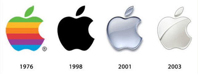
For instance, take a look at the different variations of Apple logo from 1976 to present.
Though the basic idea has remained the same, the company has introduced alterations in the style of the logo to bring about a sense of novelty, with each new version representing a new ‘phase’ to the company.
A logo has the potential to either make or break the reputation of a business, therefore, it must be designed with utmost planning and precision.
It’s important to go through a trial and error process to test multiple logos and choose the one that seems to be the perfect representation of your brand.
Stickboy® prides itself on being innovative and constantly fostering the adoption of new technologies and ventures. This has allowed us to stay on top of the latest technologies including blockchain, machine learning, and big data analytics. This experience shows in our work, and the community agrees: we are one of the most highly awarded and recognized tech companies in the state
